Get AI Guidance From Your Phone with the New AvisoAI Mobile Experience
Jul 30, 2020
With mobile app usage up 40% year-over-year in the second quarter of 2020, even hitting an all-time high of over 200 billion hours during April, we are thrilled to announce a refresh of Aviso AI’s mobile application. When the pandemic started, our customers (which include leaders such as Honeywell, Dell, Splunk, RingCentral, and FireEye) indicated a desire to enable their sales teams to work more effectively on revenue work from home and remote environments. Building on our recent launch of Digital WarRooms, Aviso’s mobility refresh includes:
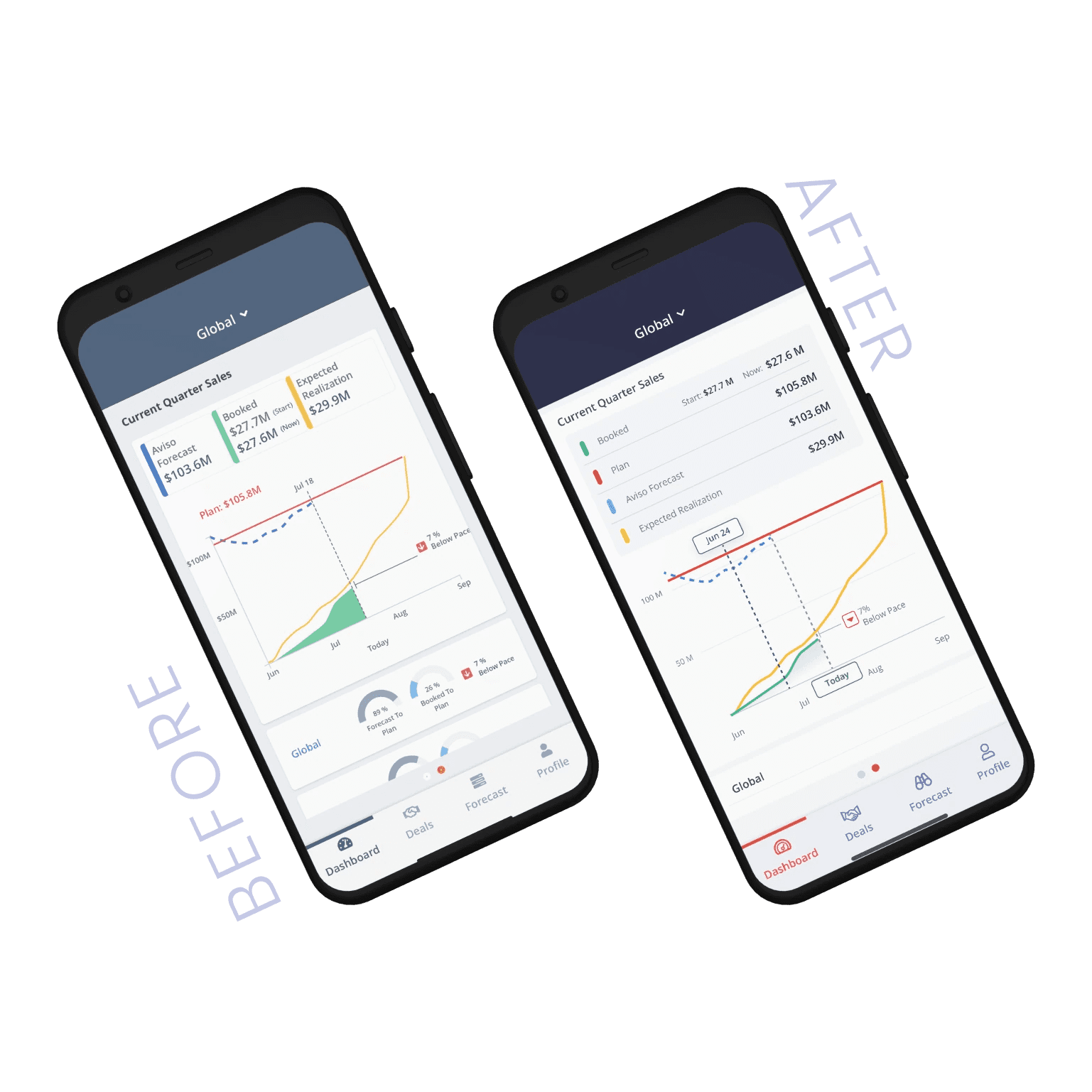
[1] An upgrade of the app to the Aviso Lighthouse User Experience with a new color palette, and several usability improvements. This includes a new login screen, improving visibility, a more prominent and legible font set, and streamlined navigation. An example of color change is the use of the Sunset-Red colored Aviso logomark to key AI columns along with a deep blue-toned purple (that we call Evening-Blue) font color to any data that is powered by our AI core.

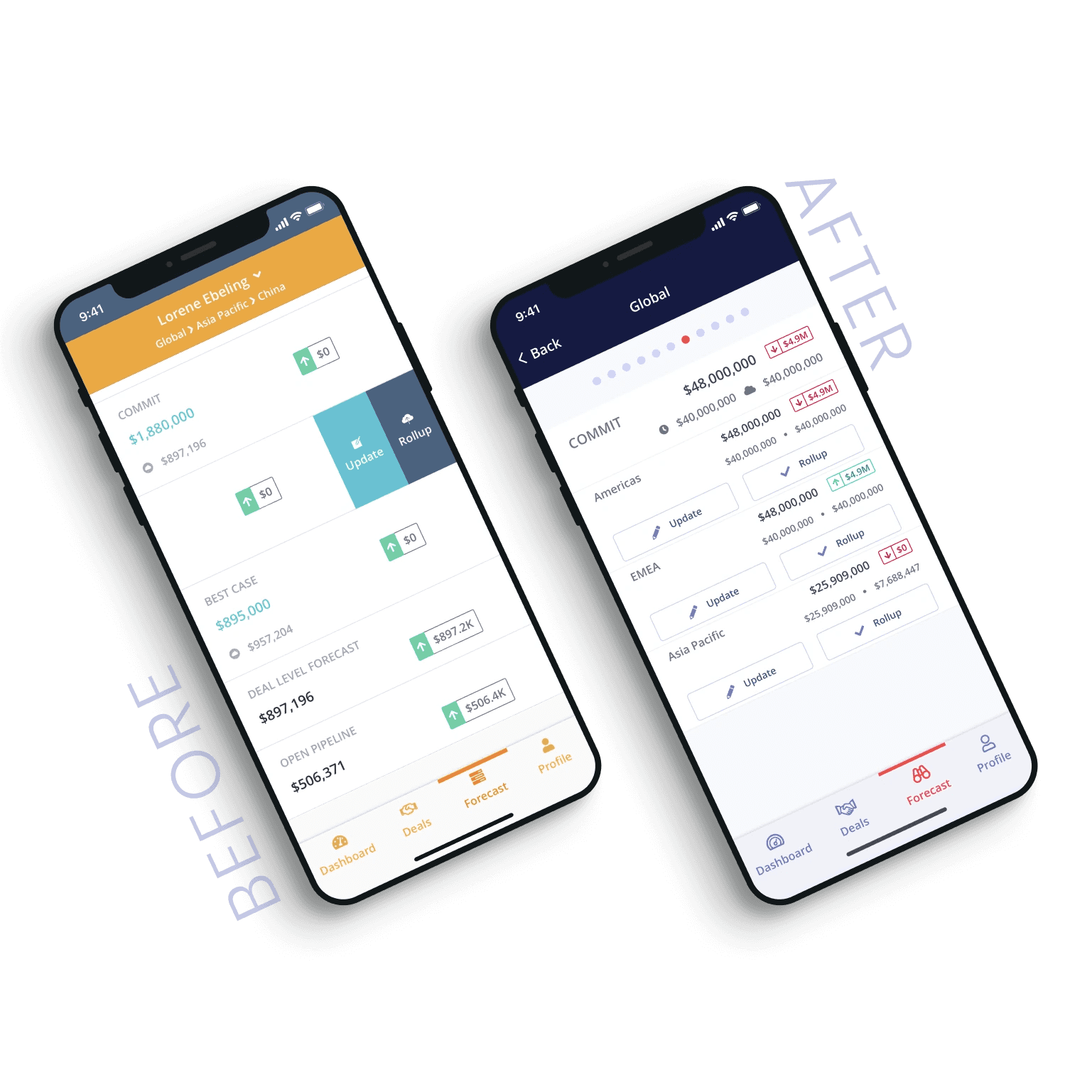
[2] Upgrades to the individual and team Forecast Update experience with better placement of contextual actions to update forecasts at every level of a team’s hierarchy, as well roll up forecast capabilities for managers and VPs of Sales.
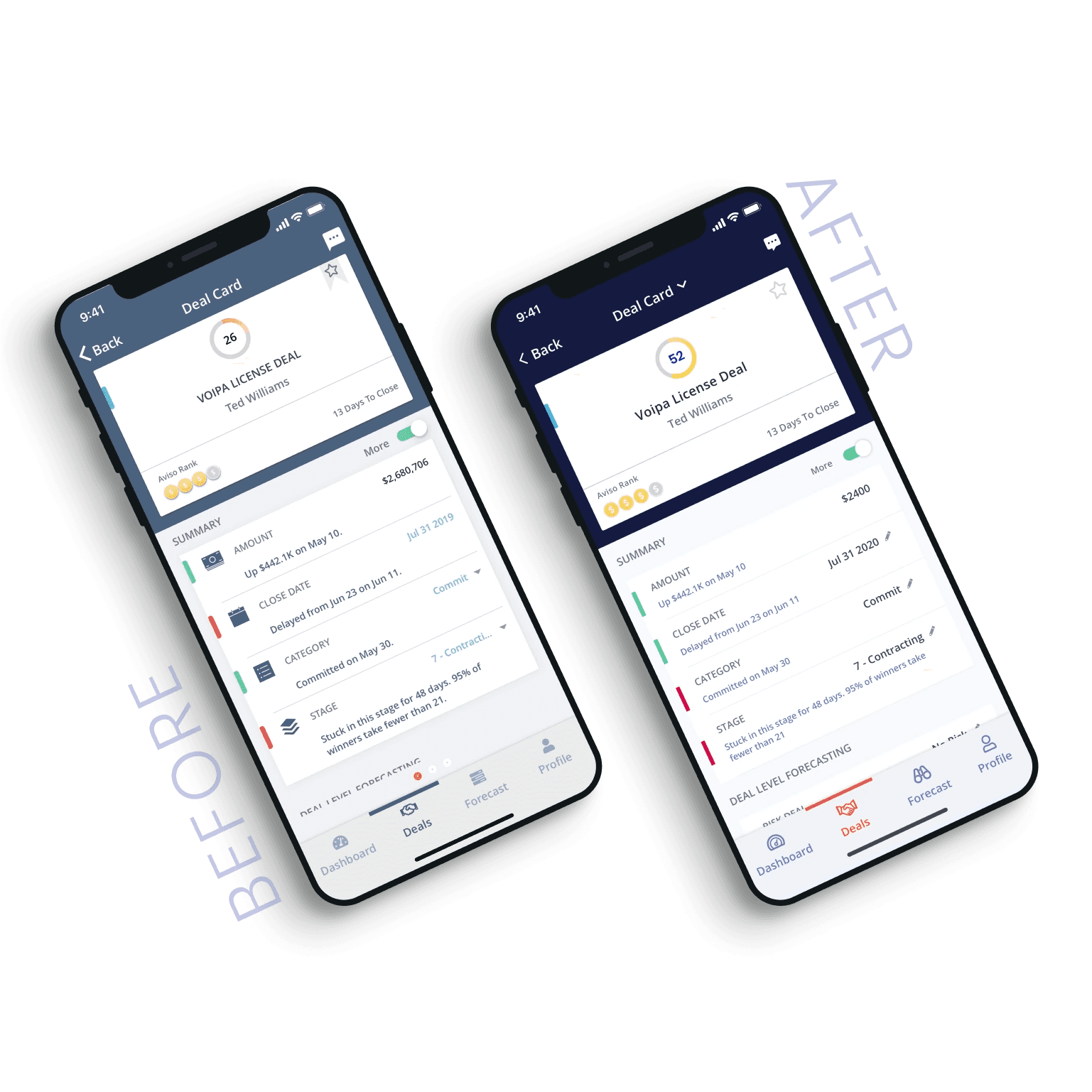
[3] An upgrade to our Deal Views and Deal Guidance capabilities with updated visual Deal Cards, new toggles for At-Risk deals, more intuitive visualization of deals in forecast versus out of forecast, updated filter and comments icons, updated favorite icon, and a consistent Win Score style with the web.
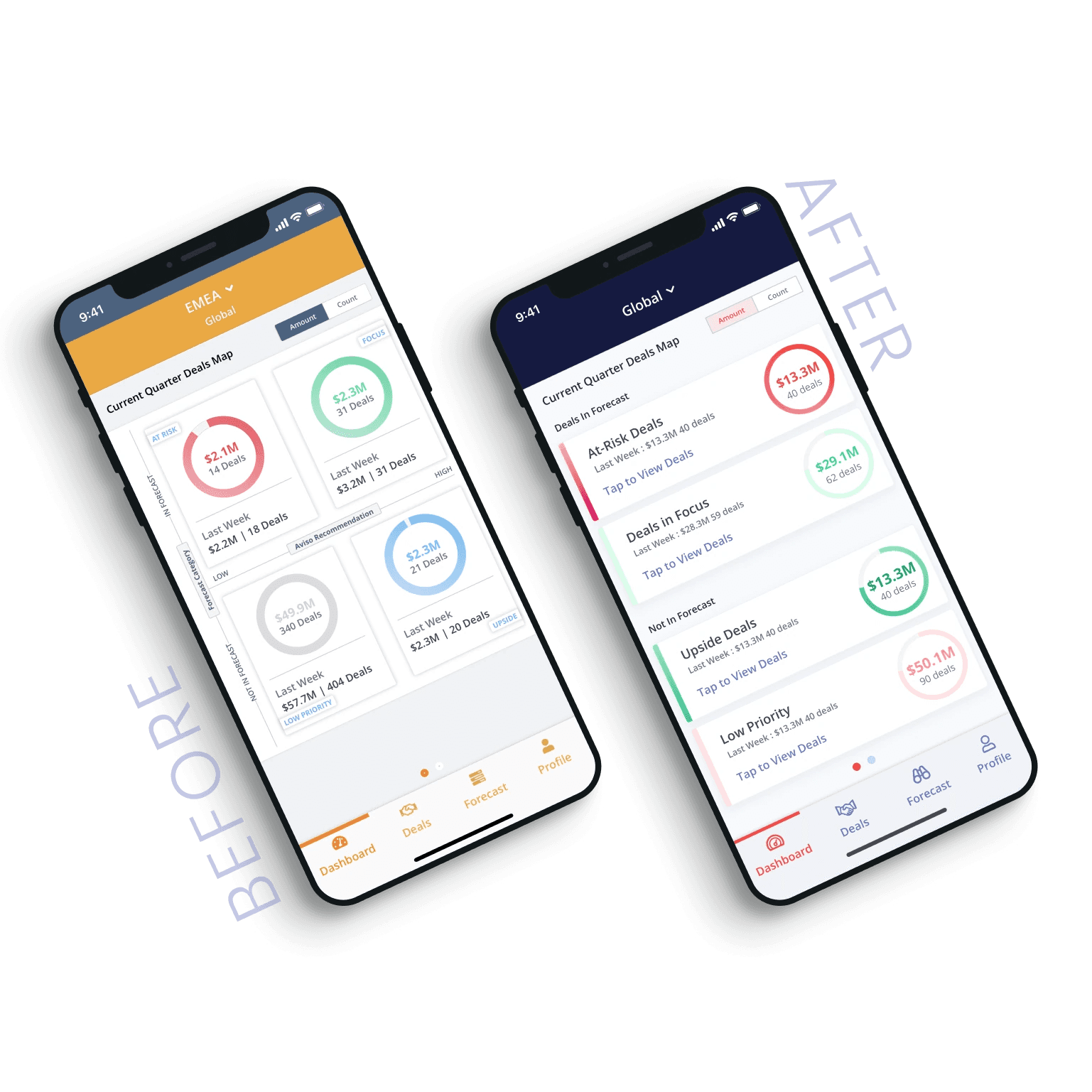
[4] Upgrades to the Aviso Opportunity/Deal Map. Following a similar pattern to the web styling, we have two sections: one for “In Forecast” and the other for “Not in Forecast”. Each quadrant has been re-styled as individual rows and follow similar card-styling as the web with the circle and data on right and labels on left.
[5] Upgrades to the Pacing Curve to help sales reps and managers know where they stand on a given day versus where AI recommends they should be. Column and row layout has been redesigned for easier viewing with styling and line thickness changes in the charts and cards.
